Blog Posts
Friday, December 13, 2019
My Favorite Photoshop Tutorials
In looking for the perfect tutorials that the web had to offer, I found that I favored ones that were simple and to the point. I like when I can feel I have learned a significant amount of information that I should useful to me developing skills on an application further. I chose 3 that reflected this. Each has a focus on highlight 10-20 topics that are essential to becoming proficient in Photoshop. I really enjoyed masking tutorials and tutorials that walked you through a design.
Friday, December 6, 2019
Friday, November 22, 2019
Business Cards
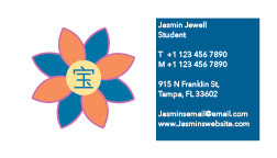
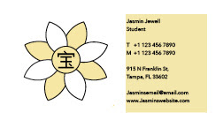
My business cards feature my logo along with some contact info. My goal for this project was to make a card that is simple and functional. I think I generally suceeded in this. I chose a more minimalist style becuase I thought it would look more attractive and professional to employers. I chose the main color for each card based off of the color selection I chose for my logos. My favorite one is the blue card. I like the way these came out because they are to the point and let my logo shine.
Monday, November 18, 2019
My Favorite InDesign Tutorials
1. https://youtu.be/AshfNo-i8Ws
This first tutorial will lay down the foundation for all you need to know in beginning to use Adobe InDesign. I really liked this one because it is short, to the point, and focuses on essentials that will allow you to have a base level knowledge of InDesign tools. After using InDesign, I found many of the tips to be incredibly useful and factual.
2. https://youtu.be/mVW8AF2TMnw
I usually tend to be a bigger fan of tutorials that break down the basics in a way that is equally informative and digestible. This tutorial breaks down 10 of the key skills that will set you up to be proficient in InDesign. I found it informative and all the tips listed were ones that I have or plan to use in the future.
3. https://youtu.be/g-lm_rP79C4
This tutorial is one of my favorites. It not to long but more detailed than some other tutorials. It provides a lot of useful information and detail through each step. The creator of the video takes there time to break down each all the information and in the end our are better equipped to use InDesign.
Wednesday, November 13, 2019
Doll
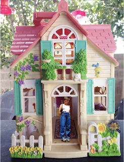
In this assignment, I tried to choose a landscape that would make me a doll and also provide me with a landscape that matched my desired theme. From the photo of myself that I chose, I decided a 90s era doll house would be a cool option to place myself into. I wanted it to feel nostalgic and look as if I was as someone in that time would be. I used a few filters to make the blend more homogenous and realistic. I really liked this assignment and I think it allowed me to improve my masking skills significantly. I like the style of the result and I think the color match turned out really well. It ended up looking a lot more realistic than I thought it would. I thought this was definitely one of my favorites because I was really able to bring my design to life.
Monday, November 4, 2019
Analogous

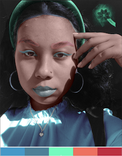
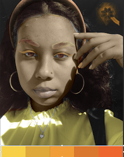
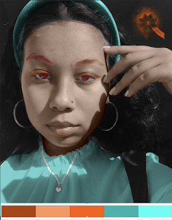
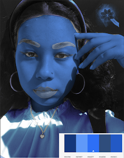
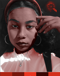
For this project, I tried to choose a variety of color options that showed the best application of what we have learned in class. I found this to be one of the more difficult assignments we have done this semester. It took a lot of time and concentration to mask out each element and get it looking the way I desired. I chose this photo because I figured that I would enjoy experimenting with skin and changing the colors on my face. I used a few filters to make the blend more natural as if it were my own skin. I found that really interesting although I takes some time. I really enjoyed using adobe color for my design and experimenting with shade and colors. Overall, this assignment taught me a lot about masking and photoshop. I think I learned quite a bit in the end due to how much time I spent trying to learn the mechanics of the program.
Tuesday, October 29, 2019
Brush
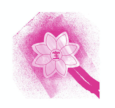
My tag brush is shown above in pink. I chose pink because I wanted a brighter color to allow my logo to stand out even more. I also really liked the color pink so it was an obvious choice. As for my logo, it represents aspects of my heritage and personal identity. The flower is due to me being named after the jasmine flower and the Chinese symbol in the center translates to “treasure”. It’s a symbol that’s has always been used in my family because my last name is Jewell. The design represents me in many ways and acts as a portrayal of my identity. The tag brush will be my signature on the rest of my designs.
Subscribe to:
Posts (Atom)


